Sunday, December 2, 2018

Copper - What Is On The Cards?


On September 18, 2018 I wrote a short piece on copper. At that time I was bullish but the red metal, contrary to my opinion, went slightly up and then entered a pretty long consolidation period. And up to now nothing has changed.

Further, consolidation periods are hard to analyze. However, there are some tools that may help to identify the state of the market during these problematic periods.

In our case - as the chart below shows, since middle September 2018 the copper has been trading in a narrow range of $2.65 – $2.88 per pound (the green rectangle):


Source: Stockcharts

It is a stressful situation for investors and speculators and many of them are wondering what next is on the cards. Let me try to give you a clue using the Commitments of Traders reports. To remind you, these reports disclose the positions held by a few groups of traders involved on the copper futures market. Today I would like to discuss the positions held by the so-called Money Managers (big speculators trading copper futures). Let me divide these traders into two groups: the bulls (Money Managers holding a gross long position in copper futures) and the bears (Money Managers holding a gross short position).

Now, according to the COT reports, between September 18, 2018 and November 17, 2018 (the consolidation period) the bears cut their bearish bets by 15.6 thousand contracts while the bulls increased their position by 14.5 thousand contracts. What does it mean? Well, it looks like the current consolidation period has been used by the bulls to increase their bullish position in copper futures. On the other hand, the bears have retreated losing the initiative on behalf of the bulls.

So the final outcome is as follows: in my opinion, the copper is getting ripe for another leg up. This thesis is additionally supported by a few historical facts. For example, the previous consolidation period (April 2018 – May 2018) looked similarly – the copper prices were flat and the bulls were taking the initiative; then, in June, copper prices started a strong move up.

Last but not least – look at this chart:

Source: Simple Digressions

The chart shows the global stocks of refined copper reported by the world’s main exchanges: COMEX, LME and SFE (the Shanghai Futures Exchange). Note that since the end of March 2018 the stocks have gone down by 605 thousand tons (a drop of 57%). Definitely, it is a long-term bullish signal for copper but we should keep in mind that the physical market is of limited value as long as trading decisions are concerned. 


Friday, November 30, 2018

Newsletter - Update

The tenth issue of Newsletter has been just dispatched. Please, check your e-mail boxes and let me know if there is any problem.

Thursday, November 8, 2018

Gold Whispers That The US Dollar Is Ahead Of A Leg Down


In my last piece on the US dollar and gold (October 21, 2018) I made the following conclusion:

“It has to be also noted that the excessive optimism among the speculators trading US dollar index futures is accompanied by extreme pessimism among their fellows trading gold futures. As a result, there is an extremely positive mix of sentiment, supporting a bullish thesis on gold and the precious metals market”

Since the publication the gold has not changed its price while the US dollar is up 0.4%. So, generally, both instruments have done nearly nothing. It means that it is a good time to look at the general picture once again. Here it is:


Source: Stockcharts

I think the chart shows quite an interesting pattern:
  • The US dollar is printing a double top formation (the green, horizontal line)
  • The gold is relatively strong, compared to the greenback (two red circles)
Logically, when the US dollar is topping the gold is supposed to test its previous bottom but…it is not the case now. Note that at the latest US dollar top (October 31, 2018) the gold, instead of getting close to the latest bottom at $1,170 - $1,180 per ounce, was standing at $1,215 per ounce.

In other words, the gold is suggesting us that the scenario discussed in my latest articles (bullish for gold and bearish for the US dollar) is still valid.

Monday, November 5, 2018

Newsletter - Update

The ninth issue of Newsletter has been just dispatched. Please, check your e-mail boxes and let me know if there is any problem.

Sunday, October 21, 2018

A Quick Look At Gold And US Dollar (Going In Tandem)


On September 30, 2018 I published a short piece on the US dollar. The conclusion was as follows:
…if something cannot go up pushed by hordes of optimists, it is supposed to go down. Summarizing – I am bearish on the US dollar in the medium term”

After nearly one month the situation has not changed too much. Over that period:
  • The bears (big speculators betting on a weaker US dollar) increased their bets by 1.5 thousand contracts
  • The bulls (big speculators betting on a stronger US dollar) added 2.4 thousand contracts to their bullish bets
  • As a result, the total balance was positive for the bulls – a net long position held by big speculators in US dollar index futures has risen by 0.9 thousand contracts


As a result, the average speculator trading US dollar index futures is overly optimistic about the US currency but the problem is that this huge optimism has only marginal impact on the greenback itself – since September 30, 2018 the US dollar has strengthened by a mere 0.7%. I am not surprised – if everybody is in one camp, most probably the opposite happens.

What is more, over that period the gold has strengthened as well (by 2.7%) so we have quite an interesting situation where the gold (red arrow) and the US dollar (green arrow) are going in the same direction:


Source: Stockcharts.com

It has to be also noted that the excessive optimism among the speculators trading US dollar index futures is accompanied by extreme pessimism among their fellows trading gold futures. As a result, there is an extremely positive mix of sentiment, supporting a bullish thesis on gold and the precious metals market. 

Sunday, September 30, 2018

US Dollar - I Am Bearish


According to the COT data, since May 29, 2018 the big speculators betting on a stronger dollar have increased their bullish bets by 13.0 thousand contracts. Over that period the bears (big speculators betting on a weaker dollar) cut their bets by 21.4 thousand contracts. As a result, a net long position held by these traders went up by 34.4 thousand contracts but…the US dollar index has not changed at all (94.8 on May 29 compared to 94.7 on September 28):


source: Simple Digressions

What is the takeaway for speculators? Well, in my opinion, if something cannot go up pushed by hordes of optimists, it is supposed to go down. Summarizing – I am bearish on the US dollar in the medium term.

Tuesday, September 18, 2018

Copper Looks Promising


It looks like there is a good chance for better times for copper. Look at the chart below:


Source: Simple Digressions and the COT data

Note that now the so-called commercials, mostly copper producers, hold a net long position in copper futures (the red circle). Last time they held a similar position was October 2016 when copper prices were at the beginning of a vicious bull market (the green circle).

If I am correct, we may be ahead of another leg up in copper and this week’s white bullish candle (just forming) could be the first sign of it:


Source: Stockcharts.com


Thursday, September 13, 2018

The Eighth Issue of Simple Digressions Newsletter Has Been Dispatched

The eighth issue of my Newsletter has been just dispatched. Please, check your e-mail boxes and let me know if there is any problem.

Tuesday, September 11, 2018

US Dollar At A Pivotal Point

I am pretty sure that the gold bugs are totally depressed now. Since May 2018 gold and silver have been in their short-term downward trends and, despite extreme pessimism among North American speculators trading gold and silver futures, it looks like the precious metals market is doomed.

However, wait a moment and  look at this chart:


source: Stockcharts.com

Well, I hate classic technical analysis indicators as, for example, the MACD (Moving Average Convergence / Divergence) indicator (the lower panel of the chart) but sometimes these indicators work quite well (and, please, do not ask my why - I have no idea).  

In the case of MACD  - note that in the beginning of 2017 it delivered a SELL signal for the US dollar index (the red circle). Shortly after the US dollar started a long-term downward trend.

Interestingly, these days MACD is very close to generate a SELL signal once again (the blue circle). If that is the case, the precious metals market (very often going in the opposite direction to the US dollar) could start a new leg up that nobody expects. 

Summarizing - it looks like the US dollar is at its pivotal point now. From the technical point of view it should renew its upward trend very soon (probably this week). 

But if it does not, we may see a sudden and rapid deterioration and...a restart of an upward trend in precious metals.


Thursday, July 26, 2018

Chart Of The Day - Trend Following In Action

Today just one chart illustrating how "Trend following approach" works:

Facebook:


source: Stockcharts.com

Monday, July 23, 2018

Seventh Issue Of Newsletter Has Been Dispatched

The seventh issue of my Newsletter has been just dispatched. Please, check your e-mail boxes and let me know if there is any problem.

Sunday, July 15, 2018

US Stocks - Is It A Healthy Bull Market?

Although NASDAQ is making new historical highs, the market internals do not support these tops. Look at the chart below:


source: Stockcharts.com

The lower panel of the chart shows the amount of stocks establishing new 52-week highs. Note that despite the index making new all-time highs (the blue arrrow on the upper panel of the chart), the amount of stocks doing the same is rapidly going down (the red arrow).

Well, it is not a typical pattern printed by a healthy bull market...

Sunday, July 8, 2018

Are We In A Bear Or Bull Market In Precious Metals?

The gold market looks like being in a typical short-term bear cycle:


The green line indicates that since middle April 2018 the gold has been in a downward trend.

However, this chart says something different:

The chart shows a popular gold market performance measure, the gold / silver ratio. To remind you, during the furious bull markets in precious metals the ratio is going up. And vice versa  - during a bear market it goes down. The message delivered by the above picture is quite simple - the precious metals market is in a bull cycle.

And the last chart:


This time the chart shows another popular performance measure, the GDX / gold ratio. Once again, during a typical bull market in precious metals GDX (or gold mining companies) outperform the gold itself. The blue up-trending line evidences that the precious metals market is in its bull cycle.

So the question is: "Are we in a bear or bull market in precious metals?"

Thursday, June 14, 2018

Latest Developments On The Precious Metals Market

We live in interesting times. Generally, gold and the US dollar go in the opposite directions but after the latest FED decision both instruments go in tandem:


source: stooq.com

What is more, most recently the silver / gold ratio exploded to the upside but gold still cannot break above an ultra short-term resistance at $1,307 - $1,310 per ounce (the red, dotted line on the lower panel of the chart):


source: Simple Digressions

Finally, JP Morgan is furiously hoarding silver:


source: Simple Digressions

I think there is something big in the making...

Sixth Issue Of The Simple Digressions Newsletter

The sixth issue of my Newsletter has been just dispatched. Please, check your e-mail boxes and let me know if there is any problem.

Tuesday, May 22, 2018

Gold And Silver - I Am An Optimist

It happened at last. Now there is high or even extreme pessimism among big speculators trading precious metals futures on the COMEX. Look at these two charts:

                                   source: Simple Digressions

and this one

                                  source: Simple Digressions

The chart shows current (as of May 15, 2018) net positions held by money managers (big speculators) in gold and silver futures at the COMEX. Note that these traders are very pessimistic about gold (red circles on the upper panel of the chart) and silver (blue circles on the lower panel). 

For example, money managers trading silver futures hold a large, net short position. Interestingly, even at the end of the latest bear market in precious metals (December 2015) these speculators were less pessimistic. 

The same pattern is visible on the gold chart - yes, money managers are now less pessimistic than at the end of 2015 but their pessimism is comparable to that visible at the latest bottoms (red circles).

As a result, as a tough contrarian, I am once again optimistic about gold and silver in the short and long-term perspective.

Sunday, May 20, 2018

Fifth Issue Of The Simple Digressions Newsletter

The fifth issue of my Newsletter has been just dispatched. Please, check your e-mail boxes and let me know if there is any problem.

Wednesday, May 2, 2018

Despite The US Dollar Getting Stronger The Gold Holds Quite Well

After the FED's decision to keep interest rates unchanged the gold was quite strong. Despite the US dollar making another ultra-short term top, gold prices held well:

source: stooq.com

Note that yesterday (May 1) the US dollar broke above its resistance (the red line) but gold did not break below its ultra-short-term support (the green line). So there is a small, positive (for gold) divergence.

What does it mean? Generally, in the long term it means nothing at all (the big picture remains unchanged) but in the ultra-short-term we may see gold prices going a bit higher now (as I wrote in my latest piece - it is a very primitive short term trade). 

What is more, the GDX / gold ratio is supporting a relatively bullish thesis on gold:


source: Simple Digressions

As the chart above shows, since late March 2018 the ratio has been in its upward trend. Interestingly, this time it is a promising medium-term signal (the shares of precious metals mining companies are stronger than bullion). It looks like Mr. Market wants to tell us:
"Not everything is that bad with precious metals as it looks"

Monday, April 23, 2018

Silver - The Big Selling Has Just Started

Gold bulls are definitely excited. As the chart below shows, most recently gold and the goldollar index got very close to their strong resistance. What is important, both instruments did it in tandem:

source: Simple Digressions

Additionally, a silver / gold ratio made impressive breakout supporting a bullish thesis on the precious metals market:

source: Simple Digressions

However, my advise is simple: do not even touch this market. In my opinion, a prudent speculator should stay away from gold in particular. Why? Well, in the long term there is no pivotal change here - gold still cannot break above its resistance at $1,350 - $1,375 per ounce and each short-term upswing is followed by a counter-action. In other words, in the long-term we see the same old story (consolidation period) and in the short-term the game is quite primitive: buy gold when it is 2% - 3% down from the recent ultra-short-term top and sell when it hits the $1,350 - $1,375 zone.

Last thing - a few days ago JP Morgan started its typical game. After a long period of silver accumulation the bank (or, better said, somebody storing silver in the JP Morgan warehouse at the COMEX) started selling silver bullion. This game is also very simple - the excited silver bulls started buying silver bullion en masse and higher demand was met with appropriate supply. As a result, in just four days the bank withdrew 3.0 million ounces of silver from its warehouse:

source: Simple Digressions

In other words, silver bulls should keep in mind that there is somebody to satisfy their hunger. What is more, he has a lot of silver...

Wednesday, April 11, 2018

Will the Gold Break At Last?

Today gold was at a tiny distance from breaking above its strong resistance level but...it failed.

However, the current move still looks good:


 source: Simple Digressions

The chart shows the goldollar index and gold prices. Note that this time both instruments go in tandem, which validates the current move in gold prices.

Thursday, April 5, 2018

Note To The Subscribers - The Fourth Issue Of Newsletter Has Been Dispatched

The fourth issue of the Simple Digressions Newsletter has been dispatched. Please, find it enclosed in your e-mail boxes.

Thursday, March 29, 2018

And They Are Still Hoarding Silver

This year, up to now, JP Morgan has hoarded as many as 20.4 million ounces of silver in its COMEX warehouse:


source: Simple Digressions

Interestingly, the JPM warehouse has been reporting higher silver stocks since 2015 (no matter at what price the silver was trading). If they continue hoarding silver at the same pace as in 1Q 2018, at the end of 2018 they would have had around 200 million ounces of silver (now there are 140 million ounces at JPM warehouse).

For better comparison, SLV, the world's largest private owner of silver bullion, holds 318 milion ounces of silver now (JPM Morgan also has its silver stake there).

Well, it is a lot of silver (global annual mine production is around 900 million ounces) so the question is:
Why are they doing it?

Wednesday, March 28, 2018

What I Am Looking At While Waiting For A Major Breakout In Precious Metals (Or For Godot*...)

In my opinion, there is a good chance that precious metals will finally break above the latest cyclical tops established in July / August 2016.

However, to do it, gold has to be stronger than the US dollar using an absolute measure. Or, in other words, applying the concept of the goldollar index:


source: Simple Digressions

As the chart shows, most recently gold and the goldollar index have bounced off their strong resistance (two horizontal lines and blue arrows). In my opinion, a major breakout will be only valid when both instruments break above their resistance at the same time (more or less). It means that a prudent speculator should closely watch the way gold and the goldollar index perform.

As always, the devils is in the details but at this point the issue is quite simple. As long as gold and the goldollar index do not break together - be careful.

* - "Waiting for Godot" - a play by Samuel Beckett

Sunday, March 11, 2018

Is It The Best Time For Commodity Investing?

In the long-term investing one has to keep in mind a typical sequence:

During economic expansion the first asset class to top are treasuries. Then the stocks are topping and, finally, commodities.

Look at the chart below:


source: Stockcharts.com

The chart shows this rule in practise. If I am correct, treasuries had topped in 2016 (blue circle). The stocks are probably topping now (the green circle), even  despite the latest all-time high made by Nasdaq 100.

Finally, commodities, represented by the CRB index (unfortunately this index is overweighted by oil), are breaking above the long-term resistance level at 195 (the red circle).

Summarizing - if I am correct, now there is time for commodity investing...

Friday, March 9, 2018

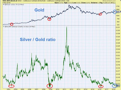
Prepare For A Major Breakout In Precious Metals

It looks like we are ahead of a major breakout in precious metals. Look at the chart below:


                                  source: Stockcharts.com

The chart shows a popular precious metals performance measure - a silver / gold ratio. As you surely know, gold and silver prices go in tandem but silver overperforms gold during a bull market and under-performs during a bear market in precious metals.

That is a theory. In practise, very often the ratio is a lagging indicator. For example, in the beginning of this bull market in gold (no, I am not kidding - in my opinion, we are still in a bull market in precious metals) the silver / gold ratio was going down (January - March 2016). Then it followed the rule and went up.

Interestingly, in July 2016 the ratio printed its cyclical top and since then it has been going down sending us a message that not everything was good with the precious metals market. And yes, since July 2016 gold was not able to break above the latest cyclical top at $1,350 - $1,375 per ounce.

These days the ratio is once again very close to its multi-year bottoms (red and blue circles on the lower panel of the chart). However, the latest bottoms (red circles) were established when gold prices were very close to their bottoms as well.

This time (the blue circles) the ratio is at one of  its lowest levels but gold is not.

In my opinion, very soon the ratio should start another move up (if history repeats). It means that gold should follow the ratio but this time the move in gold should start from the current level ($1,330 an ounce). 

If I am correct (and lucky), we should see a major breakout in gold (and silver ) prices soon.  

Tuesday, March 6, 2018

Precious Metals Market - A Sign Of Improvement?

Since the cyclical top in gold prices (July 2016), the silver / gold ratio has been steeply going down:


source: Stockcharts.com

Well,  it is not a pattern the gold bugs are looking for. Generally, the silver / gold ratio and gold prices go in tandem - the opposite pattern supports a bearish thesis on precious metals. And since the last top in gold prices the pattern drawn by the silver / gold ratio was typical for a bear market or a consolidation phase in precious metals.

However, today we have the first sign of improvement - the silver / gold ratio is breaking above its resistance (the dotted red line on the chart below):


                                           source: stooq.pl

On the other hand, the gold bulls should be cautious because gold is still below its strong long-term resistance of $1,350 - $1,375 per ounce. Most recently every time gold was close to this resistance its prices were bouncing off and...dropping. So, be cautious and patient...

Thursday, March 1, 2018

Note To The Subscribers - A New Pick Has Been Added

The third issue of the Simple Digressions Newsletter has been dispatched. Please, find it enclosed in your e-mail boxes.

Please, note that I have added a new pick to the portfolio.


Tuesday, February 20, 2018

COMEX - JP Morgan Silver Holdings Are Skyrocketing

Here is an updated chart showing JP Morgan COMEX warehouse silver holdings:


source: Simple Digressions

It looks like it is skyrocketing...

By the way, does anybody have any idea what this huge adjustment is about?


Sunday, February 11, 2018

US Stock Market - Expect A Short-Term Move Up

Last week VIX, a fear index, hit extreme readings of around 50 (the red circle on the chart below):


source: Stockcharts.com

In the past such a reading was a clear indication of a short-term bottom in US equities. Simply put, the speculators trading VIX futures changed their attitude into total pessimism but...they were too fast. Look at another chart:


source: Simple Digressions and the COT data

Note that at the end of 2017 the speculators were holding a net SHORT position in VIX futures amounting to 97.2 thousand contracts (in that way strongly betting on higher prices of US equities). Now (February 6, 2018) they held a net LONG position of 85.8 thousand contracts (heavily betting on lower prices of US equities).
Well, in my opinion, the latest change in speculators' attitude was too big and too fast so...I expect a short-term move up soon.

Monday, February 5, 2018

JP Morgan And SLV - What Is Going On?


It looks like JP Morgan is moving its silver from iShares Silver Trust (SLV) to its COMEX warehouse. Look at this table:

data in millions ounces of silver

source: Simple Digressions

Note that since 2017 the changes in SLV holdings match the changes in JP Morgan holdings. This pattern is particularly clear this year - JPM increased its holdings by 7.9 million ounces of silver up-to-date while SLV reported a decrease of 7.7 million.

Last year JP Morgan added 37.3 million ounces to its COMEX warehouse while SLV reported a decrease of 20.7 milion.

Now the question is what it is all about.

By the way, there are 127.3 million ounces of silver at JP Morgan's COMEX warehouse. (as of February 5, 2018). To give you some comparison - the annual silver production is 886 million ounces (2016) so JP Morgan (or its clients) hold around 14.3% of the world's silver production. 

Friday, February 2, 2018

US Dollar - Is It Close To The Bottom?

It looks like we are very close to the end of a bear market in the US dollar. Look at this chart:


source: Simple Digressions and the COT data

The grey bars represent the net positions held by big speculators trading US dollar index futures. Note that the current position held by these traders is SHORT.

However, despite the US dollar index being at its lowest level since January 2015, the net short position is not that large as it was at the end of November 2017 (the green arrow) when the previous bottom in the US dollar index was printed (the red arrow).

In other words, the speculators are not that pessimistic about the greenback as they were in November 2017. In my opinion, it is a common pattern visible during bottoming phases. Hence, expect the US dollar to consolidate or even go higher soon...

Thursday, February 1, 2018

Note To The Subscribers - A New Pick Has Been Added To The Portfolio

The second issue of the Simple Digressions Newsletter has been dispatched. Please, find it enclosed in your e-mail boxes.

By the way - due to the fact that my subscribers are mostly interested in Newsletter (to remind you - in each issue of Newsletter I discuss and report the results delivered by the 2018 Precious Metals Portfolio and present an investment idea), I have decided to offer Newsletter only. The appropriate changes in the payment boxes have been made.

Please, note that I intend to offer my service for many years to come (it is not a one-year service). Hence, the payment boxes offer a subscription.

Sunday, January 28, 2018

Gold At A Pivotal Point

Gold prices are very close to their strong resistance level at $1,350 - $1,380 per ounce:


source: Stockcharts.com

A thesis on a final breakout is supported by the physical demand. For example, the IAU ETF has added a large amount of gold in January up-to-date (465 thousand ounces):


source: Simple Digressions and IAU

On the other hand, the Goldollar index is lagging (the blue arrow) behind gold prices (the green arrow), which is a sign of a short-term correction coming:


source: Simple Digressions

Summarizing - we are at a pivotal point for gold. Although I opt for a short-term correction, I would not be surprised to see a big leg up in gold starting soon...

Saturday, January 13, 2018

Gold And The GolDollar Index

One of my readers has asked me about the Goldollar index. Here are the updated two charts:

Long-term picture


source: Simple Digressions

Note that most recently the Goldollar index has bounced off its long-term trend line and now it is marching higher.

Short-term picture

source: Simple Digressions

However, in the short term there is quite a big divergence between gold and the index (which, generally, go in tandem). Gold has crossed above its strong resistance (the blue circle) while the index is still below a similar resistance level. It looks like a short-term correction or a stall in gold prices is in the making.

Thursday, January 4, 2018

Sandstorm Gold 2017 Production Figures

Today Sandstorm Gold (SAND), one of my favorite streaming companies, announced production figures for 2017. Here is the chart showing historic figures:

source: Simple Digressions

The picture is clear - there is steady growth at Sandstorm. Each year the company adds new streaming / royalty contracts and lifts up the amount of gold equivalents delivered.

However, let us look at the company's sales from a short - term perspective (two years). Here is the appropriate chart:


source: Simple Digressions

Well, now the picture is not that bright - since the first quarter of 2017 the sales have been going down (look at the red arrow).

What is the takeaway for investors? Well, I would not bother too much about the short-term perspective. Precious metals mines do not deliver  the same or only higher amounts of gold and silver each quarter - sometimes production goes down for a while. It is the long-term perspective that counts so...relax. Sandstorm is on the right track.

Monday, January 1, 2018

My Lack Of 2018 Predictions Of Gold / Silver Prices

2017 has just ended so it is a good time to make predictions for 2018. However, the problem is that I do not make predictions - I have no crystal ball and no idea what will happen this year. The only thing I can do reliably is to look at the current state of a few financial markets and discuss the patterns they present.
Let me apply this approach to the gold and silver markets. As usually, I am going to use the data delivered by the Commitments of Traders reports 

Silver
From the contrarian perspective silver looks very attractive. For example, Money Managers, big speculators trading silver futures, hold a net short position (the red circle):

Source: Simple Digressions and the COT data

Last time they were that pessimistic about silver was July 2017 (the blue circle). At that time Money Managers were also holding a net short position in silver futures. Then, over the next two months the prices of silver went from $15.6 to $18.2 per ounce (an increase of 16.7%).

Another example – the ratio defined as:
Gross short position held by Money Managers / gross long position held by Money Managers

Now the ratio stands at 1.14 which means that the majority of speculators are betting on lower prices of silver:


                           Source: Simple Digressions and the COT data
In the past, when the ratio was in the area marked in yellow, silver presented an excellent medium-term (up to six months) buying opportunity. As the chart shows, the ratio is once again in that area.

Gold

Although gold looks less attractive than silver (from the contrarian perspective), it is still a buying opportunity. My self-invented gold sentiment index is below 40%. In most cases such a low reading indicates pessimism among big speculators trading gold futures (but it is not excessive pessimism):


                                    Source: Simple Digressions

And pessimism is what the contrarian speculators look for. Note that at the end of 2015, when gold was bottoming, the index was standing at 0% (everybody was busy in predicting lower prices of gold) indicating an excellent buying opportunity. Then a bull market in gold started.

Now, during bull market cycles the best buying opportunities are when the index is flashing low readings…but not necessarily very low ones (as, for example, 0%). As the chart above shows, the readings of around 20% – 40% are sufficient to expect a bottom. Now the index is flashing 35.2% so, despite a recent rally, gold looks still attractive for the buyers. However, due to the fact that gold prices are close to their strong resistance level (the area marked in yellow on the chart below) a near-term correction is likely:


                                                        Source: stooq.pl